
Packaging
Editor’s Note (Feb. 2, 2026):
Since publication, the packaging redesign has prompted mixed reactions within the whiskey community, with some praising the improved shelf clarity while others have raised concerns about brand consistency and lamenting the loss of the old packaging. This article has been updated to reflect that broader discussion.
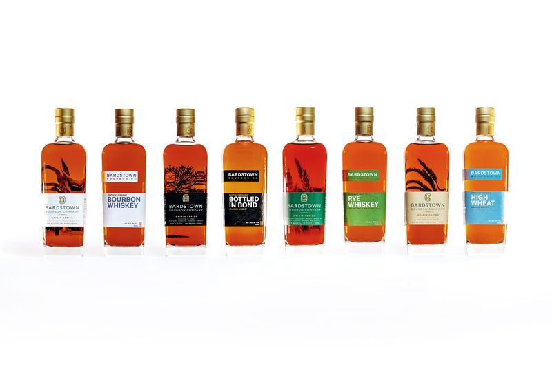
Bardstown Bourbon Company has announced a comprehensive packaging redesign across its core portfolio, reflecting the brand’s continued commitment to innovation while maintaining its award-winning American Whiskey quality.
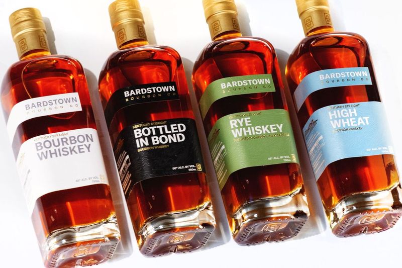
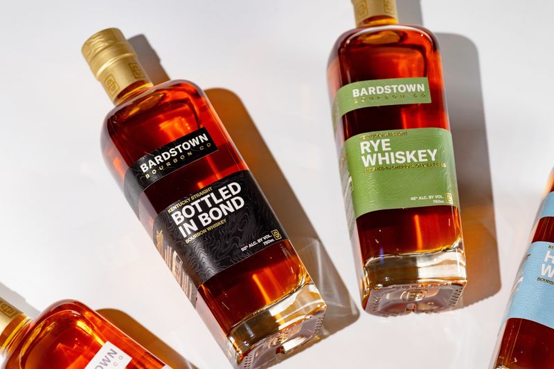
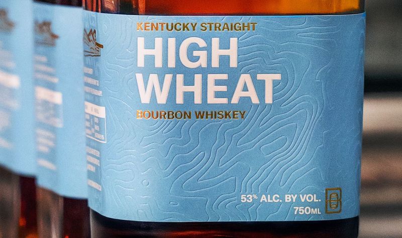
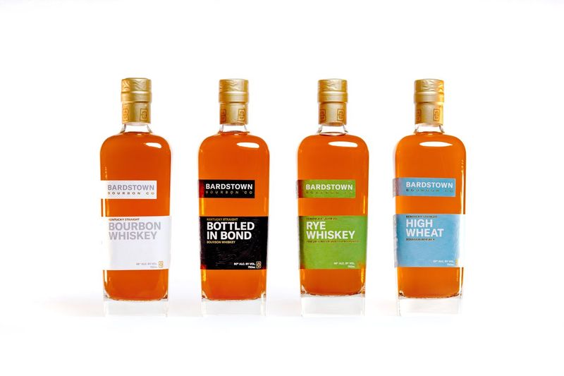
The refreshed designs roll out starting Spring 2026 for key offerings including Kentucky Straight Bourbon Whiskey, Bottled-in-Bond, High Wheat Bourbon, and Kentucky Straight Rye, with later updates extending to the Single Barrel Program, Discovery Series, and collaborations. A new single barrel option will also be added to the by-the-barrel program, offering buyers the chance to select Wheated Bourbon in addition to existing options.
The redesign incorporates:
- Enhanced shelf visibility: Bold typography and distinctive iconography
- Clear product communication: Prominent designations for each expression
- Premium materials: Soft-touch labels and weighted corks for elevated presence
- Authentic storytelling: Debossed topographical maps nod to the brand’s Kentucky roots
According to Lofted Spirits President Pete Marino, the goal is to “honor the brand’s legacy while boldly stepping into the future,” blending innovation and tradition without compromising the whiskey inside.
This move comes as Bardstown Bourbon expands nationwide, ensuring its packaging communicates the quality and personality of its portfolio in a crowded market. Master Blender Dan Callaway emphasizes: “The labels have changed. The standards haven’t. Inside these beautiful bottles is the same award-winning whiskey.”
Why This Matters
Packaging updates may seem cosmetic, but in a competitive whiskey market, shelf presence and clear expression differentiation matter. Bardstown’s redesign signals a strategic step forward for a brand that consistently balances innovation, transparency, and premium quality — a signal to both retailers and consumers about their evolving identity.
While the redesign has drawn mixed reactions, it’s worth remembering that changes like this rarely happen overnight. Packaging updates typically reflect extensive iteration, consultation, and market research, all aimed at strengthening a brand’s long-term viability. In an uncertain whiskey climate, consumers would do well to support producers willing to adapt. A few cosmetic changes are far preferable to seeing a beloved brand quietly fade into the dusty annals of whiskey history.
About Bardstown Bourbon Company
Bardstown Bourbon Company blends high-quality distillation, modern design, and hospitality to push the boundaries of American Whiskey while honoring tradition. The distillery has received global recognition, including Icons of Whisky Global Brand Innovator of the Year (2025) and IWSC Worldwide Whisky Producer of the Year (2023).